COVID-19 policy tracker 2020
A timeline of the national policy and health system responses to COVID-19 in England in 2020.
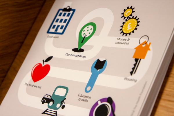
Our charts and infographics explore key health and health care trends in an accessible way. Many are available to download for use in your own work.
You may also be interested in:
A timeline of the national policy and health system responses to COVID-19 in England in 2020.
COVID-19 has disrupted hospital care for tens of thousands of patients. Our analysis covers activity trends for NHS services in England, from the beginning of the pandemic to October/November 2020.
COVID-19 has seen the rapid and widescale adoption of online and digital tools such as total triage and remote consultations. Is this shift affecting the prescribing behaviour of clinicians?
This analysis from the Networked Data Lab examines the evidence about those asked to shield during the pandemic and calls for a deeper understanding of the policy's impacts.
Explore eight key charts from our report exploring the NHS nursing workforce in England.
New analysis from the Improvement Analytics Unit looks at how shifts to total triage and remote consultation is impacting the use of emergency care.
Our new analysis shows the size of the challenge for the government and broader public sector in reducing health inequalities in England.
Coming into the COVID-19 pandemic, the UK had high levels of bed occupancy in hospitals and very little spare capacity. Our new analysis explores how hospital capacity affected mortality during the fi...
This infographic explores how the COVID-19 pandemic is affecting some groups in the UK more than others.

In this short analysis our Policy team use data from the annual GP patient survey to explore access to general practice, unpicking how patient satisfaction varies by deprivation, age and ethnicity.

We look for talented and passionate individuals as everyone at the Health Foundation has an important role to play.
View current vacanciesQ is an initiative connecting people with improvement expertise across the UK.
Find out more