Unfortunately, your browser is too old to work on this website. Please upgrade your browser
Skip to main content

Healthy life expectancy target: the scale of the challenge Does the government’s health mission measure up?

7 March 2022

About 9 mins to read
  • Adam Tinson

Key points

  • Last month’s white paper on levelling up included an ambition for the government to improve healthy life expectancy by 5 years by 2035. This piece considers the importance of such a measure and explores how realistic this target is in practice.
  • Previously published Health Foundation analysis estimated that it would take 75 years to reach 5 years of improvement in healthy life expectancy, based on the trend (for men) between 2009–11 and 2015–17. Our new analysis shows that the situation has since deteriorated, meaning the same improvement would now take 192 years. This is based on trends up to 2017–19, the latest data which exclude the effects of the pandemic.
  • The government’s levelling up target also includes narrowing the gap between the 10% most healthy and 10% least healthy upper tier local authorities. Because they are large areas, a lot of variation is missed. Many of the areas in the country with the worst health are not covered by this measure because they lie outside the 10% least healthy councils.
  • The government’s healthy life expectancy target for levelling up is extremely ambitious, but we argue that the government does not have an equally ambitious policy platform to reach the target.

Last month’s white paper on levelling up included 12 separate missions, covering areas from skills training to 5G coverage to devolution deals. The white paper also included a very ambitious target on improving health, recycled from the Industrial Strategy’s Grand Challenges: improving healthy life expectancy by 5 years by 2035 and narrowing the gap between the areas with the best and worst health. While the policy measures included in the paper seem likely to fall short, should this target be regarded as a good idea but with poor execution?

This piece considers what the measure of healthy life expectancy tells us and what different aspects of the target mean for policy plans. We look first at improving healthy life expectancy by 5 years by 2035, and then we look at the gap between the areas with the best and worst health.

What is healthy life expectancy?

Healthy life expectancy is a measure which combines average levels of self-rated health with period life expectancy. Period life expectancy assumes an individual faces a mortality risk at each age throughout their life which is the same as the current population in that place and time. For example, it assumes a 25-year-old today would face the mortality risk of a 40-year-old today when they are 40, when in fact it is more likely this will be lower by the time the 25-year-old reaches the age of 40. This means period life expectancy does not take into account expected future improvements in mortality, as a cohort measure of life expectancy does. It captures relative risk of mortality for a population at a given point in time, so is particularly useful in comparing between regions or points in time.

To calculate healthy life expectancy, a measure of self-reported health is applied to period life expectancy to calculate what proportion of life is spent in ‘good health’. This also has some limitations as it is a subjective measure, and what counts as good health can vary between groups and places. However, it is broadly considered a reasonable measure of morbidity.

Improving healthy life expectancy by 5 years by 2035

One of the more worrying trends in the UK in the decade prior to the pandemic has been the stagnation of healthy life expectancy, and life expectancy more generally. The scale of the slowdown leaves the UK standing out from other similar countries.

We previously estimated that it would take 75 years to reach 5 years of improvement in healthy life expectancy, based on the trend for men between 2009–11 and 2015–17. The situation has since deteriorated, meaning this 5-year improvement would now take 192 years for male healthy life expectancy. This is based on trends up to 2017–19, the latest data which exclude the effects of the pandemic. For women, healthy life expectancy has been on a downward trend since 2009–11, which means that overall healthy life expectancy (for men and women combined) is falling. This deterioration is complicated, and is likely the result of multiple factors.

The government’s challenge then is not to improve health faster, but to turn around a deteriorating situation. Improvement of this kind of scale is in theory possible: healthy life expectancy improved by around 4 years in 10 years to 2009–11. The context of this increase was a more benign economic environment in terms of wages and employment, increased social spending, health care, housing quality and the public realm generally, as well as a strategy to reduce health inequalities.

It is not clear in the white paper whether the government’s target is an overall average or separate for men and women. Here we consider the separate trends, because historically biological and lived experience differences have led to different outcomes, as well as the overall average. The Office for National Statistics (ONS) do not produce projections of healthy life expectancy, so Figure 1 shows simple projections based on past trends for male and female healthy life expectancy, using the 2009–11 to 2017–19 trend and the more positive 2000–01 to 2017–19 trend.

Figure 1

The chart shows the most recent data up to 2017–19, and then the projections. Applying the recent trend since 2009–11, we see male healthy life expectancy rising very slowly – increasing by around 0.5 years – up to the target date of 2035 (taken as the mid-point of 2034–37). In contrast, applying the same trend to female healthy life expectancy shows a continued decline. This is not a prediction for how healthy life expectancy will change, but highlights the scale of the challenge. Taking a longer term trend and including the 2000–2009 period (where gains in healthy life expectancy were made), male healthy life expectancy would increase by around 2.3 years and female healthy life expectancy by around 0.9 years. For overall healthy life expectancy that would mean an increase of 1.6 years.

Our projections have used 2017–19 as the base year to explicitly leave out the short-term impact of the pandemic. For example, the high mortality rates of 2020 reduced period life expectancy, which in turn will have driven a reduction in healthy life expectancy. Latest ONS projections assume that life expectancy trends will return to their pre-pandemic path in the next few years. Baselining to a pre-pandemic year would provide a better measure of progress in improving the underlying health of the population.

It is hard to overstate how difficult a target this is for the government. If they are serious about it, there would need to be considerable investment in improving general economic and social conditions as well as in public health, health care and social care. There are significant obstacles for healthy life expectancy as well, which may affect both the ‘health’ and ‘life expectancy’ parts of the measure. Before the pandemic there were pressures from weak growth in household living standards, stubbornly high poverty rates, and an ageing population. Several risk factors were driving the UK’s high burden of preventable ill health and premature mortality: while there were falls in smoking, levels of obesity remained high and there were reversals in the falling trend in alcohol consumption. The pandemic has created further pressures. These include the health care backlog and poor (but developing) understanding of the long-term implications of COVID-19 infections for individuals, as well as the wider impact on socioeconomic factors such as education, employment and incomes.

Narrowing the gap between the areas with the best and worst health

Inequalities in healthy life expectancy are often thought of in relation to differences between geographical areas. The levelling up white paper focuses on the gap between the 10% of upper tier local authorities with the highest and lowest healthy life expectancy. This shows a gap of 10.7 years in 2017–19 for average male and female healthy life expectancy.

Figure 2

Using local authority estimates has important implications for policy. We look at how these estimates are used in the indicator, as well as how they compare to other measures of geographical inequalities in healthy life expectancy.

Construction of the healthy life expectancy indicator

Taking a broader range of local authorities, rather than the extremes of highest and lowest, helps to account for outliers with potentially unique circumstances. For example, in 2017–19 a girl born in the Orkney Islands was expected to have 75.1 years of good health, compared to a girl born in Blackpool with a healthy life expectancy of 55.3 years. As the extreme values, these may be outliers in some form. Creating an average of the top and bottom 10% mitigates against this. However, this averaging also hides the scale of variation across local authorities. It would be possible for the gap between the highest and lowest local authority to widen even if the average gap reduces.

The healthy life expectancy gap has also remained relatively stable since 2009–11, with little change in the composition of the local authorities in the 10% with highest and lowest outcomes. This suggests that there is little volatility in the indicator. However, each data point is a 3-year average, meaning that we would not expect significant shifts in the metric from year to year. There is also a 2-year lag before publication of the statistics, for instance 2018–20 data are available in March 2022. We will therefore not know until 2033 whether the government’s ambition to narrow the gap between areas has been met. If we plan to assess progress in 2030 (using data for the period 2026–28), this leaves the government with only 6 years (ie now until 2028) to effect change.

Comparing between local authorities

Often inequalities in healthy life expectancy are measured on the basis of variation in health across very small local areas of around 1,500 people. One example of such a statistic ranks those small local areas by their level of deprivation. On that basis, for women in England there is a gap of nearly 20 years of healthy life expectancy between those in the most and least deprived 10% of small local areas.

Averaging outcomes within local authorities also hides a lot of variation. For instance, using data from 2009–13 on healthy life expectancy by middle layer super output area (MSOA) – small areas of 7,200 people – the range within Westminster Council (12.6 years) is bigger than the range across the country (10.7 years).

This highlights a key flaw with this measure: if targets typically drive efforts to improve what is being measured, then many of the areas with the worst health are liable to miss out. It is in theory possible to meet the levelling up target without the health of a lot of the MSOAs with the worst health experiencing any improvement.

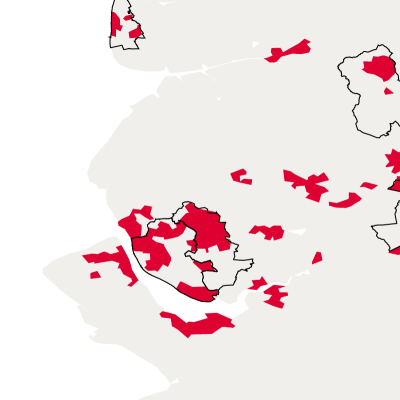
The availability of published data prevents a timelier analysis, but we can use older data (only available for England) to illustrate the point.

The map looks at average healthy life expectancy for 2009–13 in England. Areas in the 10% of MSOAs in England with the lowest healthy life expectancy are coloured in red. The 10% of local authorities with the lowest healthy life expectancy are outlined in black. As the map shows, there are considerable areas of poor health outside the bottom 10% of local authority areas: for example, in Sheffield, Nottingham and parts of the North East.

These smaller areas would not factor into the England-based target, and we would expect a similar pattern when constructed across the whole of the UK. Measuring at a lower geographical level (such as MSOAs) would focus efforts on smaller local areas with the poorest health in England, which are often not in the local authority areas with the lowest healthy life expectancy (when taken as a whole). Many of the smaller areas with the worst health are in local authorities in which other small areas have good health, bringing the overall average up.

Figure 3

The levelling up target includes narrowing the gap between the 10% most and least healthy upper tier local authorities.  

Because these are big areas, a lot of variation is missed. 

The 10% of local authorities with the lowest healthy life expectancy are outlined in black.

The map now shows healthy life expectancy by middle layer super output area (MSOA) – small areas of 7,200 people.

The 10% of MSOAs in England with the lowest healthy life expectancy are coloured in red.

By overlaying these, we see that there are considerable areas of poor health outside the bottom 10% of local authority areas: for example, in Sheffield, Nottingham and parts of the North East.

These smaller areas would not factor into the England-based target.

Although the data is relatively old, comparing 2009–11 data on life expectancy and 2015–19 data on life expectancy at the MSOA level shows a relatively unchanged picture, suggesting the same is likely true for healthy life expectancy.

Interaction between the targets

It is possible for divergence between the targets, with (for example) overall healthy life expectancy rising by 5 years, but the gap between the areas with highest and lowest healthy life expectancy widening, if (for example) there were disproportionate gains in the top 10% of areas. However, closing inequalities between areas offers one way of starting to reach the target of 5 years extra healthy life expectancy by 2035.

As it stands, only the top 10% of local authorities have an average healthy life expectancy equivalent to the 2035 target. To meet the target by closing the gap alone, would mean lifting all local authorities to meet the outcome of the top 10%. This again highlights the scale of the challenge for the levelling up health mission: something as radical as eliminating inequalities in healthy life expectancy between areas would only just meet the target.

Where does this leave the levelling up mission to improve health?

The mission on healthy life expectancy is at this point a huge challenge. We welcome the government’s high ambition, but setting such a stretching target has its own risks. There is a danger that a target that is further off than when it was first proposed in 2017 instils fatalism rather than being a focal point for action.

A recent Institute for Government report considered the setting of targets by government, which at their best can bring up standards, encourage better analysis of how to reach them, and signal a real political commitment. Using healthy life expectancy as a measure for a target poses a challenge, because health is a complex system involving a large range of relevant actors and potentially long timescales for change. This is not to say the government is wrong to set such a target, but it should be aware of the scale of the challenge. Small-scale or half-hearted interventions will see the healthy life expectancy mission missed by a long distance, or worse, see continued falls in healthy life expectancy. Meeting this target even halfway requires a large set of levers, many of which will be outside the gift of the Department for Health and Social Care. If we are to take this mission seriously, it must be a mission for the whole of government.

Further reading

You might also like...

Kjell-bubble-diagramArtboard 101 copy

Get social

Follow us on Twitter
Kjell-bubble-diagramArtboard 101

Work with us

We look for talented and passionate individuals as everyone at the Health Foundation has an important role to play.

View current vacancies
Artboard 101 copy 2

The Q community

Q is an initiative connecting people with improvement expertise across the UK.

Find out more