Unfortunately, your browser is too old to work on this website. Please upgrade your browser
Skip to main content

Charts and infographics on health and social care sustainability Our latest data visualisations on NHS finances and funding, social care, workforce and efficiency and productivity

Thumbnail

We produce charts and infographics to illustrate some of the key trends and issues in health and social care sustainability. You may also be interested in our Chart of the month series.

The changing geography of NHS deficits

  • Chart
|
  • 4 March 2016

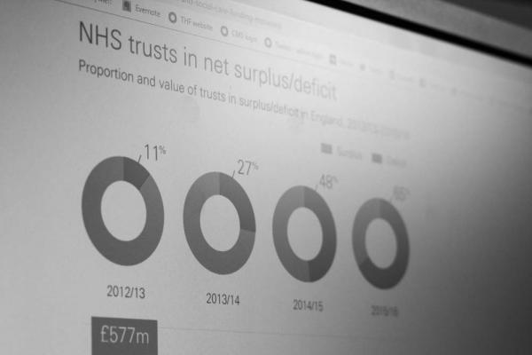
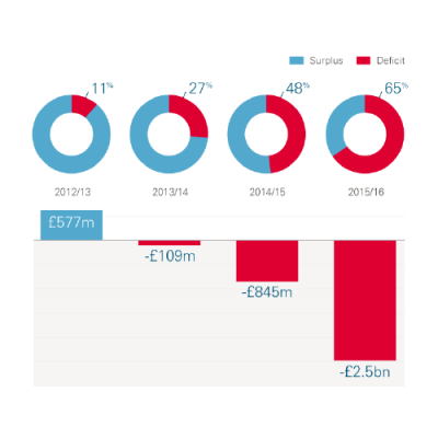
March 2016 Chart of the month. The financial position of NHS providers in England has substantially deteriorated in recent years, falling from a net surplus of £577m in 2012/13 to a net deficit of £84...

Chart: The changing geography of NHS deficits

Productivity in the NHS

  • Chart
|
  • 4 February 2016

February 2016 Chart of the month. Between 2009/10 and 2014/15, hospital productivity increased by 1.0%, at an average rate of 0.19% per year.

Chart: Productivity in the NHS
Kjell-bubble-diagramArtboard 101 copy

Get social

Follow us on Twitter
Kjell-bubble-diagramArtboard 101

Work with us

We look for talented and passionate individuals as everyone at the Health Foundation has an important role to play.

View current vacancies
Artboard 101 copy 2

The Q community

Q is an initiative connecting people with improvement expertise across the UK.

Find out more